Contentlayer with next/image
8 min read
Getting images right and fast on the web is hard. If we are doing it wrong, we create a poor user experience with slow loading times and CLS (Cumulative Layout Shift).
next/image
In Next.js we can use the next/image component to avoid this bad user experience.
next/image automatically optimizes our images in three ways to reduce the slow loading times:
- Converts the image to the smallest supported format
- Resizes the image based on the used device viewport
- Uses image compression
It also creates a placeholder to avoid the CLS.
The following example shows the usage of next/image with a static image:
import picture from "./pictures/mountain.jpg";<Image src={picture} alt="Picture of a mountain" placeholder="blur" />;
Markdown
This looks great, but how can we use it in our markdown files?
MDX
My first reaction was to use MDX and use next/image just as in the example.
But that means that we can't use normal markdown images and
it turns out that this won't work with contentlayer.
It won't work, because Next.js does some magic on the import of the static image.
The object which gets returned by the import
contains not only a path to the image,
it contains also the width and height
plus a very small version of the image for the blurred placeholder.
This magic does not work if the MDX file is loaded with contentlayer,
because contentlayer uses its own bundler,
which knows nothing about the import magic for images.
The trick with the public folder
The next idea was to use normal markdown images and to place the images in the public folder.
This eliminates the need for static imports and treats our image like a remote image.
But in order to make this work, we have to tell next/image the dimensions of the image.
If we would use a static import for the image,
the import magic would provide the dimensions for us.
To pass the width and height to the image component we use a rehype plugin called rehype-img-size.
After installation we can configure contentlayer to use the plugin within MDX, but it should work with markdown too.
The plugin will now find each image in the markdown content and pass its dimensions to the image component. If we have the following markdown content...

... rehype-img-size will look up
pictures/mountain.jpg in the public directory (as configured in the contentlayer config) and
calculate its size.
Now we can replace the image component with next/image:
And that's it, we are now using next/image to render our markdown images.
This approach works, but it is not ideal, because the images can't be located next to the content.
They have to be placed in the public directory.
- content/posts
- 2022-12-11-sample.mdx
- public/pictures
- mountain.jpg
It would be better if we could locate the images right next to the content:
- content/posts/2022-12-11-sample
- assets
- mountain.jpg
- index.mdx
We also don't have the small image for the blurred placeholder,
we can only use the empty placeholder.
If these two things are not so important to you, this is the right approach.
Custom rehype plugin
To fix the two weaknesses from the last approach, we can write a custom rehype plugin. Our plugin should do the following things:
- Copy the image from its location to the public folder
- Update the
srcattribute to the new location - Calculate the width and height
- Create small image for blurred placeholder
Before we write this plugin, we should understand how the markdown processing works in contentlayer.
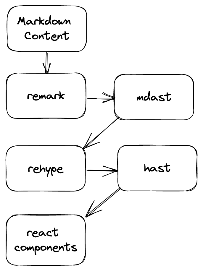
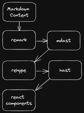
contentlayer uses remark to parse the markdown into a mdast.
We can now use remark plugins to modify the mdast.
Then rehype comes into play and converts the mdast into a hast.
rehype plugins can now modify the hast.
Finally the hast is converted into react components.

For our plugin we have to modify the hast,
because images in the mdast don't have width or height and they don't support custom properties.
The hast on the other hand supports all properties of the HTML img component and
we can pass custom properties.
Implementation
We start our plugin by defining the options:
- publicDir: path to the public directory
Then we can define our plugin. The plugin is a function which gets the options and returns another function which receives the following parameters:
- tree: the whole
hast - file: the parsed file with path and content
- done: a function which should be called when our plugin has finished
Our plugin searches the hast tree and for each element with the tagName img
we call the processImage function.
rehype plugins can't be async, but image processing is async.
That's the reason why we store each resulting Promise of the processImage function in an array and
call the done function if all Promises are resolved and the work is done.
Ok, now we can have a detailed look at the implementation of the processImage function.
At first we have to find the real path of the image.
Fortunately, contentlayer stores information about the location of our markdown file in the data field of the file.
Now that we have the path we can use sharp to read the width and height of the image.
After that we can create a small version of the image for the blurred placeholder.
We will create a png with a quality of 75, a width of 8px and we keep the aspect ratio.
Then we can copy the image to the public folder and create a new path for the src attribute of the image.
With all the information in place we can update the properties of the img tag.
After we have finished writing our plugin, it is time to configure contentlayer.
Don't forget to replace the img tag with next/image.
As we have seen in the rehype-img-size method.
Conclusion
Ok, let's summarize again what we have achieved.
We have written a rehype plugin, which does the following steps fully automatic for us:
- Copy the image from its location to the public folder
- Update the
srcattribute to the new location - Calculate the width and height
- Create a small image for the blurred placeholder
With this plugin we can use the normal markdown image syntax and gain all the benefits of next/image:
- Smallest supported format
- Resized version based on the used device viewport
- image compression
For a more complete example have a look at the article's source code.
Posted in: markdown, contentlayer, nextjs, react
